
With direct mail marketing, repetition isn’t necessarily a bad thing. In fact, sending the same postcard multiple times can actually improve recall and response—especially if the design is strong and the offer is working.
But what happens when you need to change your message, promote a new event, or update your services? How do you stay consistent without being repetitive?
This is where creative direct mail strategy shines.
Let’s take a look at a few real-world campaigns that show how companies can keep their postcards fresh while still reinforcing brand recognition:
Candlewood East Marina: Seasonal Messaging, Consistent Style
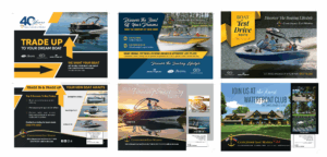
Across campaigns promoting boat test drives, trade-in events, and luxury lifestyle messaging, Candlewood East Marina sticks to:
- A core color palette of gold, black, and deep blue
- Consistent fonts and logo placement
- High-quality lifestyle imagery that evokes summer on the water
What changes: Each card highlights a new selling point—trade-in deals, waterfront club membership, or a featured model—while keeping the look and feel unmistakably “Candlewood.”
Soistman Family Dentistry: Timely, Relatable Themes
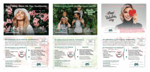
Soistman rotates seasonal campaigns for Valentine’s Day, St. Patrick’s Day, and spring cleanings. Each postcard:
- Uses playful headlines and real patient testimonials
- Features their signature values: kindness, gratitude, and stewardship
- Maintains the same contact info, pricing structure, and service list
What changes: The imagery, colors, and headline vary by season, making each mailer feel new—while the dental brand remains instantly recognizable.
Weed Man: Service-Driven Flexibility
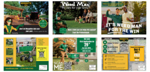
Weed Man runs frequent mailers promoting different services like pest control, fertilization, and seasonal lawn care. Their formula includes:
- QR codes and promo codes for easy tracking
- Iconography and mascot illustrations for immediate recognition
- Green and yellow branding that stays consistent
What changes: Offers, imagery, and service emphasis vary depending on the time of year and local conditions.
First Presbyterian Church: Holiday-Centered Variation
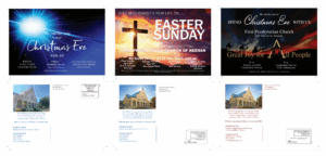
This church keeps its visuals in sync—warm tones, spiritual imagery, and familiar formatting—across both Easter and Christmas campaigns. They:
- Reinforce the inclusive messaging in every mailer
- Promote upcoming services and times clearly
- Maintain consistent fonts, logos, and contact info
What changes: The focus of each postcard (Christmas vs. Easter) and visual feel is adapted while staying brand-aligned.
Templeton Real Estate Group: Listing Highlights with a Signature Look
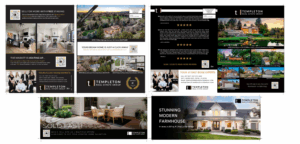
Templeton sends out high-volume postcards promoting listings, recent sales, and home valuation tools. Their branding elements include:
- A modern black-and-gold color scheme
- Clear photo grid layouts and QR codes
- Consistent agent headshots and logo use
What changes: Every mailer reflects different homes and messages (e.g. “Sold Fast!” vs. “Stunning Modern Farmhouse”) while the recognizable style builds trust.
The Takeaway
If your business sends out frequent mailings—great! Don’t shy away from repeating what works. But if you need to evolve your message, change promotions, or highlight something new, take inspiration from these brands.
By anchoring your postcards with consistent design elements (like fonts, logos, colors, and layout), you can explore endless creative directions while still reinforcing who you are.
The goal: When someone pulls your postcard out of the mailbox, they should know it’s from you—before they even flip it over.